All work
Selected work — 01
Sazu
An instant noodle range that had to read from two metres away in a fluorescent aisle and still look worth eating.
Client
Sazu
Year
2025
Role
Brand, packaging, art direction
Status
Live
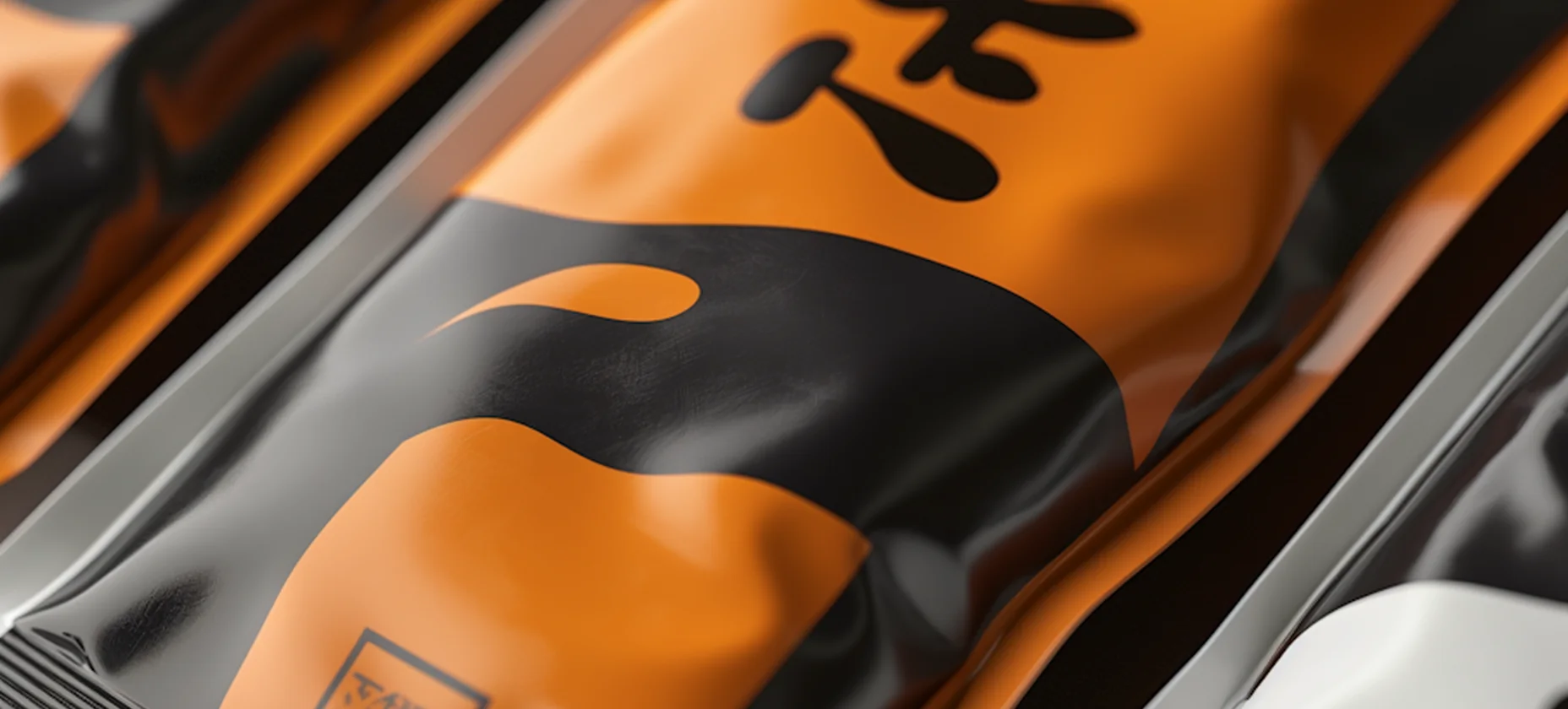
The brief
Sazu sell in convenience fridges and supermarket end caps, stacked on their sides, overlapping, usually behind a door. The old packs were designed flat, on a screen, and disappeared the moment they were put where they live.
We designed the range from a photograph of a shelf instead of an artboard.

Range — four flavours, one silhouette.
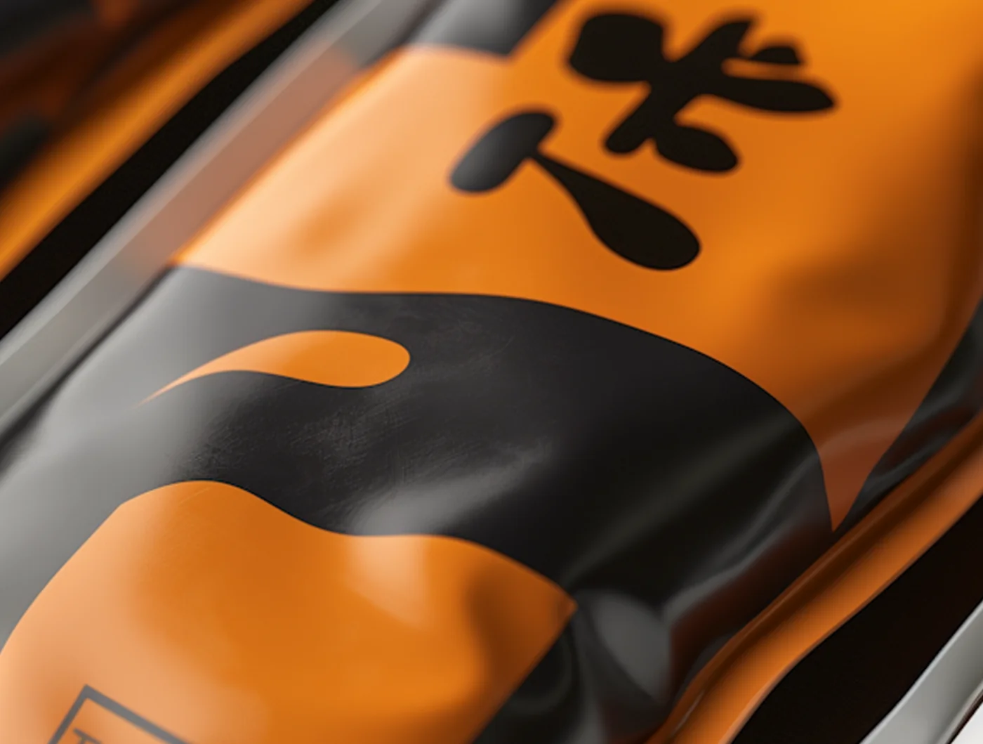
Detail — the mark at the size it is actually seen.
‘It is the first time our shelf looks like it was planned.’
Sazu, Brand Director
The making
One black field, one flavour colour, one brush mark. The mark is the only thing that changes size between formats; everything else is fixed, so a row of them reads as a row.
The foil is matte on the black and gloss on the colour, which is the whole reason the range survives bad lighting.
