All work
Selected work — 02
Plump Lab
A skincare line for people who have read the ingredients list and want the packaging to stop shouting.
Client
Plump Lab
Year
2025
Role
Brand, packaging, art direction
Status
Live
The brief
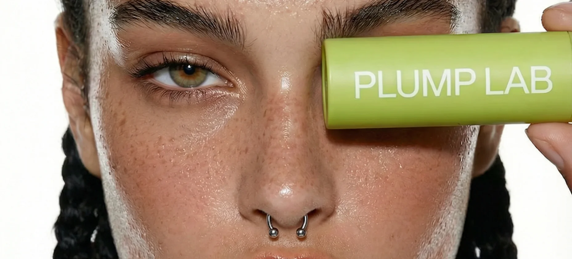
Plump Lab had a good formula and a pack that looked like six other things. The category answer is usually more: more claims, more gradient, more foil. We went the other way and gave the pack one colour and one word.
The colour does the recognising. The word does the explaining. Nothing else is allowed on the front.
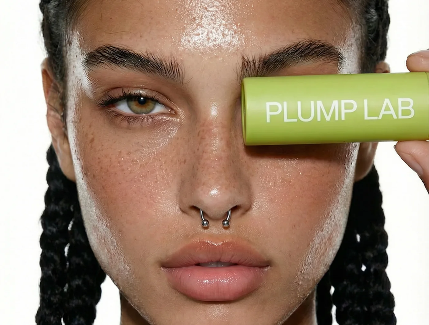
Stick — the whole identity on twelve millimetres.
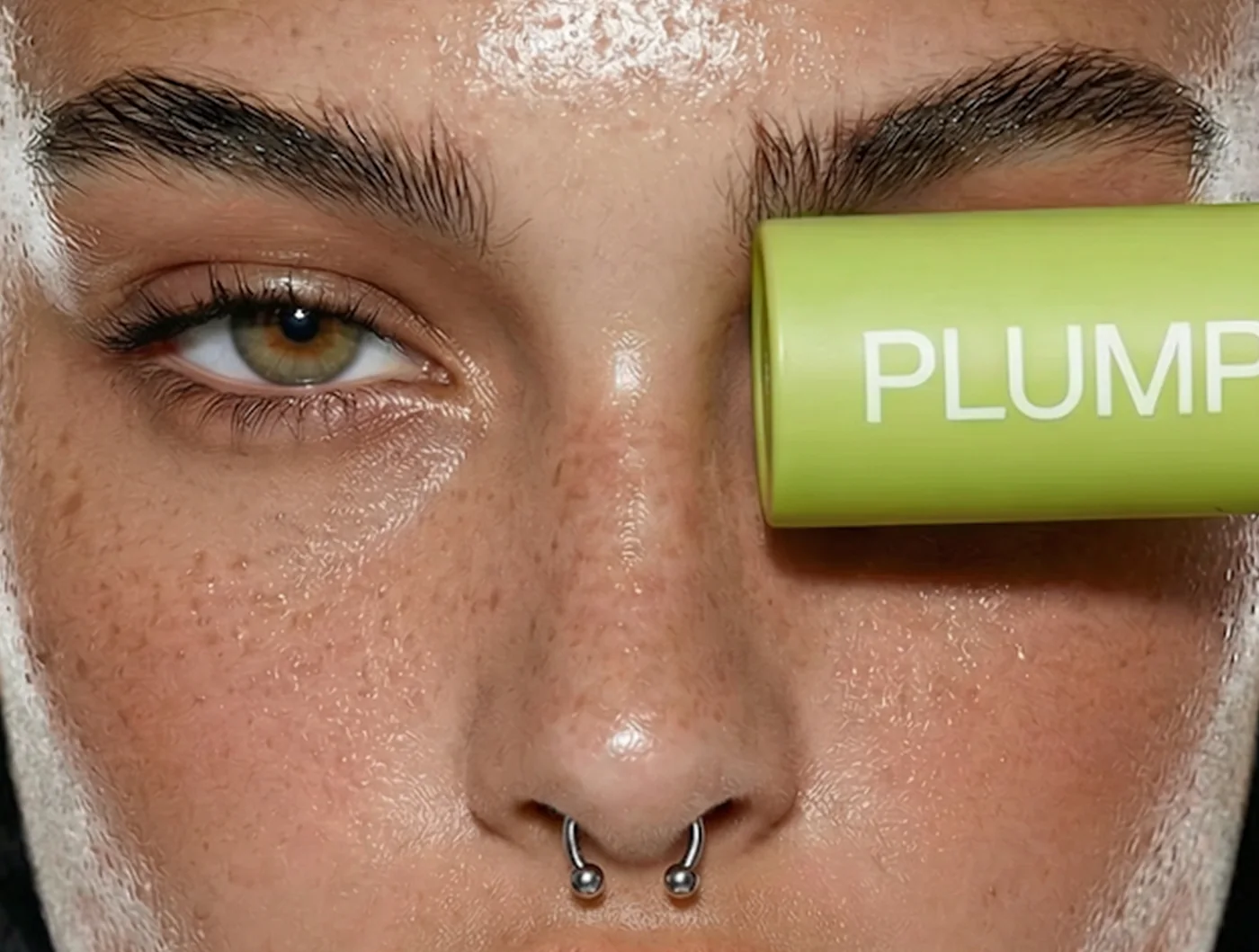
Campaign — the product where it is used, not where it is sold.
‘We stopped explaining it on the box and started explaining it on the site.’
Plump Lab, Founder
The making
The green was chosen against skin rather than against white, because that is where it is always seen.
Type is set once, at one size, centred on the barrel, so it stays legible when the stick is held at an angle in someone's hand.